Textual content in the Web environment must have one very important property – it must be easy and convenient to read. The task, it would seem, is quite simple and inherent not only to virtual publications, but also to traditional print media, but it still does not have a single solution. With the emergence of a variety of devices with access to the global network, there was a need to develop a new type of design, adapting web content to the specifics of the screen used by humans, and the problem of ensuring the readability of the text in these conditions has flared up with renewed force.
On the other hand, designers today do not have to engage in full-fledged creativity and make unnecessary efforts: there are thousands of fonts and necessary graphic solutions available online. There’s no need to come up with something new, to surprise and delight. But therein lies the problem.
According to Marko Dugonjić, creative director at the consulting agency Creative Nights, designers can do so much better if they can synthesize the current advances in adaptive design with a little bit of their own creativity.
This article will explore the ways in which familiar web typography becomes expressive.
Basic rules
You’re probably already familiar with the concept of adaptive typography and how it helps solve the complexities that tend to arise beyond the boundaries of adaptive web design. However, the key goal of this article is not to show you the advantages and disadvantages of adaptive typography at all, or even to explore it in great detail. If you have not mastered the issue, there are many sources of information on the Internet. Here is limited to enumerating the basic, basic rules of the organization of adaptive typography:
- The size of fonts should be in direct relation to the existing distance between the user and the screen. Internet resource through a tool CSS – media queries (media queries) – should recognize the type of screen and automatically adjust the site to its characteristics. But that technology won’t solve the whole problem, Marco says. He suggests using Nick Sherman’s “Size Calculator” to calculate the physical or perceived size of the font at any given distance.
- Maintain harmonious and readable proportions in a paragraph by using letter spacing, word spacing, and line height. Tim Brown’s Universal Typography is the best way to help you do this.
- don’t forget about the hierarchy of headings in your text. For this you can use the same Tim Brown modular scale. Or use different fonts of similar size.
- For small screens, to highlight a new paragraph, use the red line, for larger screens – block points or additional graphic elements (lines, shapes, colors).
- Use graded fonts to normalize the rendering (displaying on the screen) of text regardless of the screen resolution. Pixel density on the screen is a factor that you can’t influence, but it can make the readability of your text much worse. It’s much better if you don’t depend on it.
- Use fonts of different widths. Each width must match the specific type of screen. To display harmoniously on small smartphone and tablet screens, use a condensed font; for wide screens, you can use a wider font.
These are the ground rules on which all adaptive typography rests. Below is an experience of creating an online brochure based on the Benton Modern font family, using the most available adaptive design techniques. The task was to develop two layouts: the first was formal and the second was expressive.
The adaptation work was done by Marko Dagonzik, who we have already mentioned. The whole activity was divided into several stages. It should be remembered that the Benton Modern font family includes 48 styles.
A study of fonts.
First, all large and small fonts were tested: each font was compressed and stretched to the limit. Optical sizes of The Reading Size font group (special fonts designed for small screens, sizes from 9 to 14 points) were used for subheadings, and display optical sizes (designed for headings) were used for the bulk of the text.
The purpose of the tests was to identify irregularities that may have occurred when a particular style was transformed. To avoid such distortions, it was decided to use each optical size with its intended purpose.
Next, it was studied how different styles behave in the context of narrow and wide columns of text, compacted and sparse writing. Finally, all glyphs were analyzed. A glyph is an element of writing, a specific graphical representation of a grapheme, sometimes several linked graphemes. A grapheme is a unit of written speech (in alphabetic systems – a letter). The following prototype is obtained:
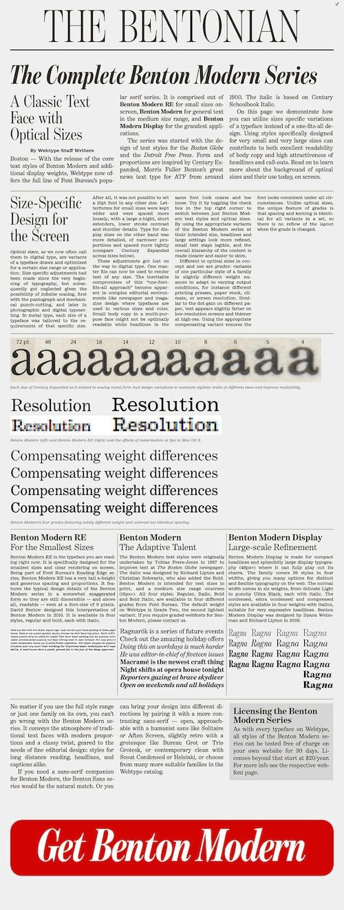
The columns were too narrow for the text to be aligned harmoniously, so it was decided to use hyphenation: it improved the text’s texture a bit.
Columns were used only when there was enough horizontal space. Nevertheless, the designers tried to avoid having columns of text stretching down the whole page: in order to read such a text format, you would need to scroll up/down while reading from one column to another, and this is not very convenient. That’s why another @Media query was introduced to check the user’s screen height before applying a column to the page.
Content formatting
Next, the designers proceeded to examine the content itself in more detail. In this way, it was possible to establish section boundaries.
The formal version was designed first. First, a large headline was created, which was a sort of replica of the big newspaper headlines, and below that was the date from which the series traces its history. There was no navigation menu in the original version, but then it was decided to add one to improve the usability of the brochure. This also made it possible to demonstrate the potential of brackets as graphic elements.
At first, the sections were somewhat monotonous and looked boring. The hierarchy and organization of subheadings, introductory paragraph and columns were created without much trouble, but the designers felt they were missing something. After a series of agonizing trial and error, dotted dividing lines appeared between sections to further emphasize the fine details in the design of the Benton Modern font family. In addition to this, the paragraph symbol § was also used.
However, none of this was good enough either, so the designers again looked through numerous glyphs to find suitable symbols for other sections. In the end, they preferred the following: § for the “About” section, – for “optical dimensions,” italicized i for “How to use this,” + for the bonus section, etc. All of these symbols are fairly rarely used in web design, so using them as decorative elements seemed natural.
Expressive details
The formal version of the web brochure, designed in the spirit of the newspaper format, turned out quite well. It was well organized, with lots of fine detail. But it wasn’t enough for the designers. Their hearts demanded aesthetics, and they couldn’t express that in a formal prototype. That’s why the idea was born to create a glossy magazine version in addition to the “newspaper” version. Below you can see the result of this work: the emphasis was kept on the same elements, but the introductory section was omitted, and each subheading was strengthened with pseudo-elements.
Сonclusion
You are probably now fully aware of how far you can go in creating virtual typography. To take full advantage of the methods described in this article, use only those font families that have multiple styles (types of lettering) and optical sizes. The only reason designers were able to create an adaptive design for an online brochure is because the Benton Modern font family has a wide variety of styles and optical sizes.